A quick coat of rust-o-leum chrome and, presto, instant change-o. Turns out it was too large for this mantle.
 Minor staging can sometimes really make a big difference- especially in photographs. Real estate photos in particular.
 Some designers say that the easiest way to make a bookcase look appealing is to use the premise of a pyramid, heavier things on the bottom, lighter, less bulky things on the top.
I don't disagree, however there are variations of this, such as the shot below. My jumping off point was that cute green botanical print on silk. I used it as the accent color and brought in other woods, woven things and natural accessories.
 I also used bar stools for the professional shots- I'll link those later.
 This was a spec project for Bridger Construction. I chose cabinetry, doors, floors, pulls, trim, wall color, lighting, plumbing fixtures, etc.
My theme was modern/rustic mountain family home.
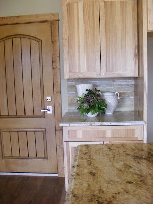
Below are the befores- plain Jane comparatively. The house is very neutral because it is spec and needs to appeal to as many buyers as possible, hence no wacky wallpaper or fuchsia stripes. Probably too personal.
Below are the befores- plain Jane comparatively. The house is very neutral because it is spec and needs to appeal to as many buyers as possible, hence no wacky wallpaper or fuchsia stripes. Probably too personal.


No comments:
Post a Comment